Main Product---
Social Realism Short,
Urban and recognisable setting,
Main character is strong and working class.
Deals with real life issues (divorce and family break-up).
Compelling piece of social realism involving sarcasm and natural speech.
(Our ancillary tasks has to represent these features of the main product or it would all be pointless)
Our Poster
Simple colour scheme, not overly complex (White, blue and grey). We didn’t want to over complicate the poster as the film itself isn’t over complicated. We wanted the main focus to be on Sam, much like in
Andrea Arnold’s Fish Tank
http://photogallery.filmofilia.com/data/media/242/fish_tank_poster_01.jpg
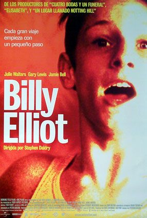
and Stephen Daldrey’s Billy Elliot
http://www.impawards.com/2000/posters/billy_elliot_ver2.jpg


Both of these film’s fall into the Social realism section, all three contain a main character on the right side of the poster, this imminently shows that the film is going to be about them and their story.
Costume, on all of the posters you can see elements of Social realisim due to the Mise en scene,
Costumes---They are things that you would see on the highstreet, and on working class people, mainly in the Billy Elliot poster with the vest top. They don’t particularly stand out of draw focus from the main character. This fits with the main film as none of the props or any of the costume are particularly overbearing. We had a lot of dull colours, so it would not distract from the action.
Setting---(excluding the Billy Elliot), The Background of ours and also Andrea Arnold’s are recognisable, Urban Gritty settings. Urban settings are a main part of social realism, In ours you can just about see a promenade and what looks like a typical sea-side bench area. In Fish Tank you can see what looks like a built up town with tower blocks in the background. These conform with the conventions of social realism mise en scene, as most films are shot in a built up area.
A good example of this would be
Shane Meadows This Is England
http://www.youtube.com/watch?v=DO2ZR1-DHpw&feature=related
http://www.imdb.com/title/tt0480025/
Angle—All the pictures have been taken from a slightly lower angle, this then reinforces power onto the main subject in the image. In mostly all social realism films it’s about power, lack of or gaining.
The space around the boy is white which means no distractions it also gives us a blank canvas to put any necessities on it e.g. Snap lines from the guardian or the Independent.
Even though the film is targeted at a younger audience, the Lines are from More middle class people, the reason I chose to do this was to also target the people that would go to the film festivals. Also even though they are middle class they are recognisable newspapers, so working class and the younger generation can still relate to the quote because they are well known companies.
http://www.guardian.co.uk/
http://www.independent.co.uk/
The ‘Chips’ title font (Andy MT) was chosen to act as the boys hand-writing the, scruffiness of it represents the main character in the poster, Also having the title in that font makes the audience connect with the poster more as it becomes personal. We want the audience to connect with Sam throughout, as the whole film is lead by his thoughts and direct speech to the audience.
I made the less personal parts in more plain and recognisable fonts, our main one being Arial. I did this because I tried it our all in Andy MT, but it just became crowed and messy. So using clean straight font for the sections that are less connected to the main base topic work well as it made it easier for people to see from a distance.
The poster includes many social realism features that fit in with the film,
The setting
The costume
The fact that the colours are not too overbearing
Strong main character
All together I would say our poster represents our film really well, and really adds to appealing to our target market. The simplicity of it fits hand in had with the simplicity of our film, Chips.
The other piece of the package is our LWL review (Little White Lies)

LWL covers all films, indented and also blockbusters.
(Also music, art, politics and more, it’s main topic being film)
- They take pride in their design, having the main issue cover run throughout, an example of this would be one of the recent Kick-Ass issue, on lots of pages there where blood-splatters underneath the text, also the colour scheme was florescent pink, yellow and green.
- Field specific language---These guys know their films and their directors.
Mainly Male market (Tweenie’s) , Film specialist, the ones that would go to independent film festivals (They live and breath film)
Because the design is extremely important in this film and also the language, as a group we combined our skill. Hollie being the Albert Instinen with words meant that she could show her skills to the max. I was able to sort out the colours and design of it (Which could not have been done without Jess), and together we’re created something I feel is of a high standard.
There are strict instructions we had to follow to get the design and language right.
- There had to be either three or four text columns
- There had to be Anticipation, Enjoyment and In Retrospect at the bottom right of the review.
- You could either have black text on white a white or white text on a black background.
- The picture has to be a screen dump and take up nearly half the page,
- Three box’s the name of the film in one, the director and main stars in another, and release date in the last.
- The release date was in line with the bottom line of the directors box
- Font’s
- On the bottom of the right page there would be a graphic related to the film
- On the bottom of the left page would be the issue name
- Field specific language
- Lexically rich
- Plot
- Comments throughout, summing up the whole thing
Graphics were optional.
We used 4 columns, including the Anticipation, Enjoyment and In Retrospect within the last column.
We also used black writing on a white background
We used a screen dump
All the box’s conform with the LWL criteria
The fonts look exactly the same
We chose to have the Salt-Water issue, bottom left to include a graphic under our text,
Hollie included lots of field specific language and the whole piece is very lexically rich, She also included the plot line and made evaluative comments throughout. Constantly referring to the family breakdown and the how we have constructed the piece in social realism.
Altogether I would say our review and our poster work well in representing the message that we were trying to get across to our intended audience. Both constantly reinforce social realism, and the message that Sam is the main character. So I believe that the whole portfolio fit together like three peas in a pod. They all support each other with colour scheme, mise en scene, and also the issue of loneliness and solidarity, that Sam seems to portray.

No comments:
Post a Comment